Warm White or Cool White: Reading the Undertone
Compare warm and cool white paint undertones against your room’s fixed finishes, so samples make sense beside floors, counters, trim and fabrics.
The common mistake with white paint is choosing from a small chip under shop lighting, then discovering at home that the walls look yellow beside the floor or faintly blue beside the cabinets. Warm white or cool white is not a contest between cosy and clean; it is a question of how a paint’s undertone relates to the colours already in the room. A simple week of comparisons can make that relationship easier to see before you commit.
What does warm white or cool white mean in a room?
White paint is rarely neutral in every setting. Its slight cast may lean toward yellow, red, or beige, which reads as warm, or toward blue, green, or gray, which reads as cool. The cast may be subtle on its own and conspicuous beside another surface.
That is why a white that looks crisp on a card can seem creamy against a cool gray countertop. The countertop has not changed; it has made the paint’s warmth easier to notice. A warm white near honey-toned oak may instead look balanced, while a cooler white beside the same oak can make the wood appear more orange.
Names such as “soft,” “pure,” or “classic” offer little reliable guidance about undertone. Treat the sample as a colour to compare, not a promise contained in the label. The room’s fixed finishes supply the context the paint chip lacks.
Which existing colours should you compare first?
Start with surfaces that are difficult or expensive to change: flooring, stone or laminate counters, tile, brick, built-in cabinetry, and large upholstery. These are the room’s colour anchors. A white wall will sit beside them for years, so their undertones matter more than a cushion you might replace.
Look at each anchor in ordinary daylight and under the lamps used in the evening. Oak can read golden in one part of a room and muted in another; a gray tile may carry a green or violet cast that becomes clearer beside white. Do not try to name every undertone with certainty. The practical question is whether the candidate white makes the existing finish feel harmonious, more pronounced, or oddly out of place.
Then consider the other large colours: curtains, sofas, rugs, and painted trim. If a room contains both warm wood and cool gray fabric, there may be no white that makes every element look identical in temperature. Choose which fixed relationship matters most, and let the remaining colours retain their own character.
How can a week of sampling reveal the undertone?
Use a measured routine rather than deciding in one glance. A few days of observation are useful because daylight changes, and the same sample can look different at a window, across the room, and after sunset.
- Day one: Gather several white paint cards or sample pots whose descriptions suggest different undertones. Include one that seems warmer and one that seems cooler, rather than collecting near-identical whites.
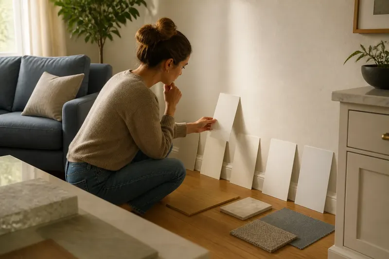
- Day two: Hold the cards directly beside the main fixed finishes. Compare them against the floor, counter, tile, or cabinet door, one at a time. Keep the cards close to the surface; comparing them across the room weakens the visual relationship.
- Day three: Apply sample paint to large pieces of white poster board, or use sample boards prepared for paint. A small patch can be swallowed by its surroundings and is difficult to move. Mark each board discreetly on the back so the candidates do not become an anonymous white parade.
- Day four: Place each board near the most important finish, then move it to another wall. Check it in morning light and later in the day. Avoid judging only where direct sun lands, since that can wash out distinctions.
- Day five: View the candidates with the room’s usual lamps on. Warm bulbs can make a cool white look less stark; cooler light can make a warm white seem more creamy. The point is not to correct the sample for every possible bulb, but to notice whether the room’s regular evening light changes your preference.
- Day six: Compare finalists beside trim, ceiling paint, and large fabrics. A wall white that looks lovely against a wood floor may make existing bright-white trim appear dingy. Decide whether the trim should remain a separate white or whether the walls should relate more closely to it.
- Day seven: Review the boards where they will actually be seen and remove candidates that repeatedly clash with a fixed finish. Choose between the remaining options by deciding which one gives the room the more coherent overall impression.
Say you have honey-toned oak floors, a blue-gray sofa, and a warm white sample that seems pleasant in the hallway. When you place its board beside the sofa and floor, the yellow cast becomes prominent; a less creamy white may sit more comfortably between them. The observable result is not that every surface turns neutral, but that the floor and sofa remain closer to their intended colours.
What should you do when the room mixes warm and cool finishes?
Choose a visual priority instead of searching for a mythical white that cancels every undertone. In a kitchen with warm wood cabinets and cool stone, decide whether the wall colour should support the cabinetry or sit quietly with the counter. Then check that decision from the room’s main viewpoints.
Sometimes the better answer is a restrained white with a less obvious cast. It can act as a bridge without making the warm and cool finishes identical. A strongly warm white may intensify golden wood; a strongly cool one may make warm materials look more orange by contrast. Neither reaction is automatically wrong, but it should be deliberate.
Pay attention to adjacency. White trim touching a wall colour can make their difference obvious, while a ceiling separated by shadow may appear closer in colour than it is. If trim is already painted, sample the wall candidate directly beside it. If trim will also be repainted, compare the two proposed whites together rather than choosing each in isolation.
Why does the same white change during the day?
Daylight varies in direction and strength, and nearby colours reflect light back onto a wall. A white near a leafy garden may pick up a greenish cast; a wall beside brick can look warmer than the same paint on an interior wall. These shifts are part of the room’s actual appearance, not an error in the sample.
Artificial light matters too. Bulb colour, lampshades, and the materials around a fixture all influence how white appears after dark. Compare samples under the lighting you normally use, but do not attempt to accommodate every lamp in the house if that would force an awkward choice in the room itself.
What is not worth the effort is chasing a white that looks perfectly unchanged in every corner and at every hour. Walls respond to their surroundings. A consistent, pleasing relationship with the room’s principal finishes is a more useful aim than visual sameness.
Which questions help settle a white paint choice?
Does warm white always make a room feel cosier?
It can read softer beside cool finishes, but the effect depends on the other colours and the light. Beside golden wood, the same warmth may look distinctly creamy rather than quietly inviting.
Does cool white make a room look brighter?
It may look crisper beside warm materials, but brightness also depends on the room’s light and surrounding surfaces. A cool white that clashes with the floor can feel harsh rather than fresh.
Can I compare paint chips under store lighting?
Use store lighting only to narrow the choices, since it does not reproduce the light or finishes in your home. Make the final comparison on sample boards in the room, beside its fixed colours.
Should walls and trim be the same white?
They can be, but separate whites create a visible contrast that should be checked rather than assumed. Compare the actual candidates together, because each can change how warm or cool the other appears.
How do you make the final comparison useful?
Keep the finalists in place long enough to see them at the times you use the room. Stand where you enter, sit near the largest upholstered piece, and look toward the principal window. The same white may read differently from each position because the neighbouring colours and light are different.
Write down a short observation for each candidate: for example, “too creamy beside the counter” or “works with the floor but makes the trim look gray.” These notes focus attention on relationships rather than vague impressions. If two options remain close, consider which fixed finish should lead the room and choose accordingly.
Before buying paint, confirm the product’s finish and application guidance with its label or manufacturer instructions; sheen can affect how a colour is perceived. For the colour decision itself, return to the simplest test: compare warm white or cool white beside the room’s most important existing finishes, in the light you actually live with. A useful white does not erase those materials; it lets them sit together without an unwanted colour argument.